RoadRUNNER Covers Through Time
The first thing you see when you look at a RoadRUNNER issue is the cover. As a subscriber, it’s what greets you in the mailbox and gets you excited to flip through the pages to see what’s inside. If you see our magazine on the newsstand, the cover is what determines if you’ll even pick it off the shelf.
We spend a lot of time choosing the right photo and the most exciting and descriptive words for each cover page. After 25 years, we still don’t have the answer to what will make for an attractive cover on the newsstand—but we can make some educated guesses. Here are some covers we’ve printed throughout the years, with some behind the scenes insights.
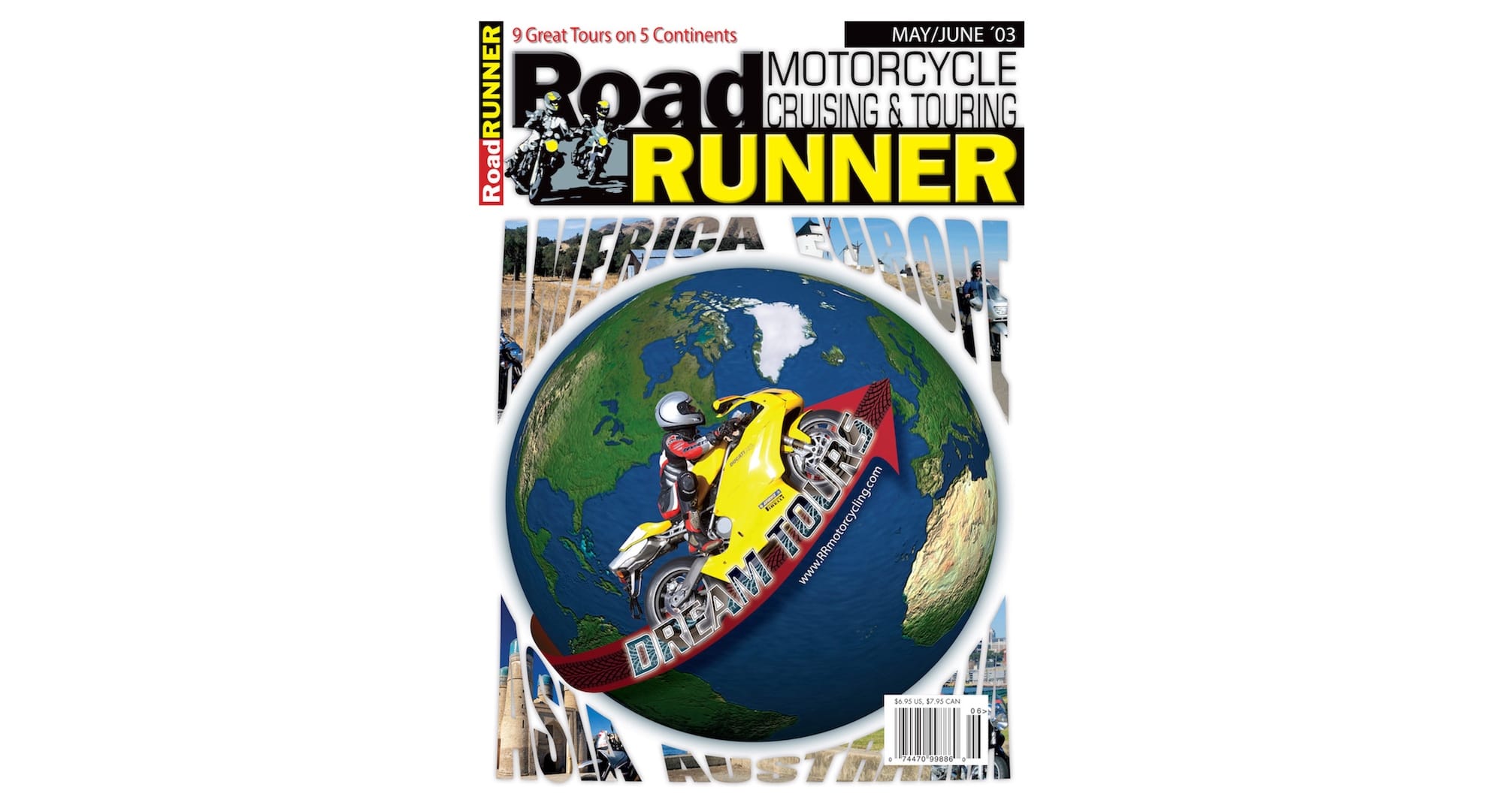
Our distribution consultant warned us that this cover was a bad idea. He was right. As great as this Jun ‘03 issue’s contents were, it was our worst-selling one on the newsstands. Fortunately, this happened very early on and we learned a valuable lesson.
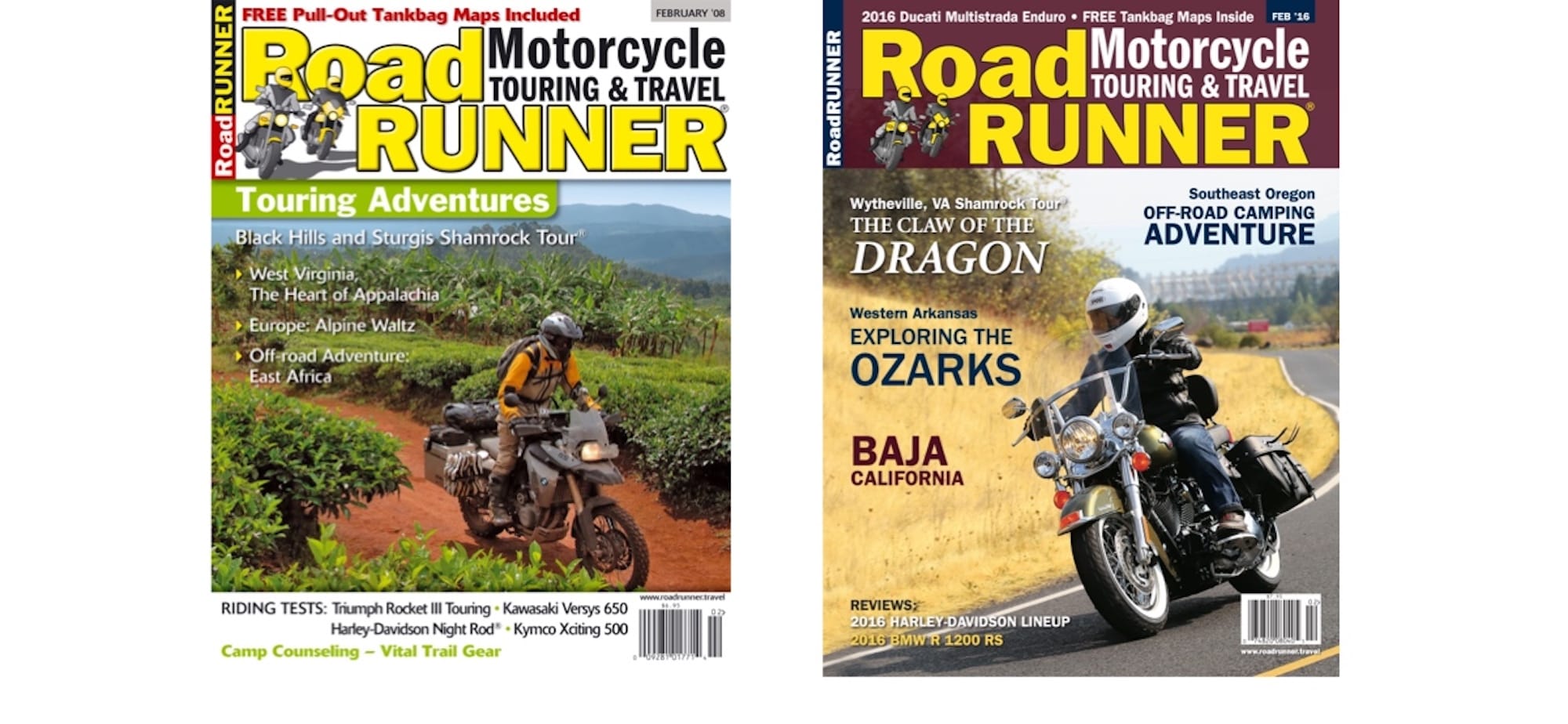
What makes an issue sell? Is it the image? The motorcycle? Or does the cover text inspire riders to pick up the mag? After a quarter-century, we think the time of the year might have more to do with it. Our Jan ‘08 issue with the first F 800 GS sold well, with a striking, exotic cover image. Then, a rather neutral cover on the Jan ‘16 issue also knocked it out of the park, but the word “dragon” popped out. The common denominator? Both were Jan/Feb issues. Winters get long for us motorcyclists!
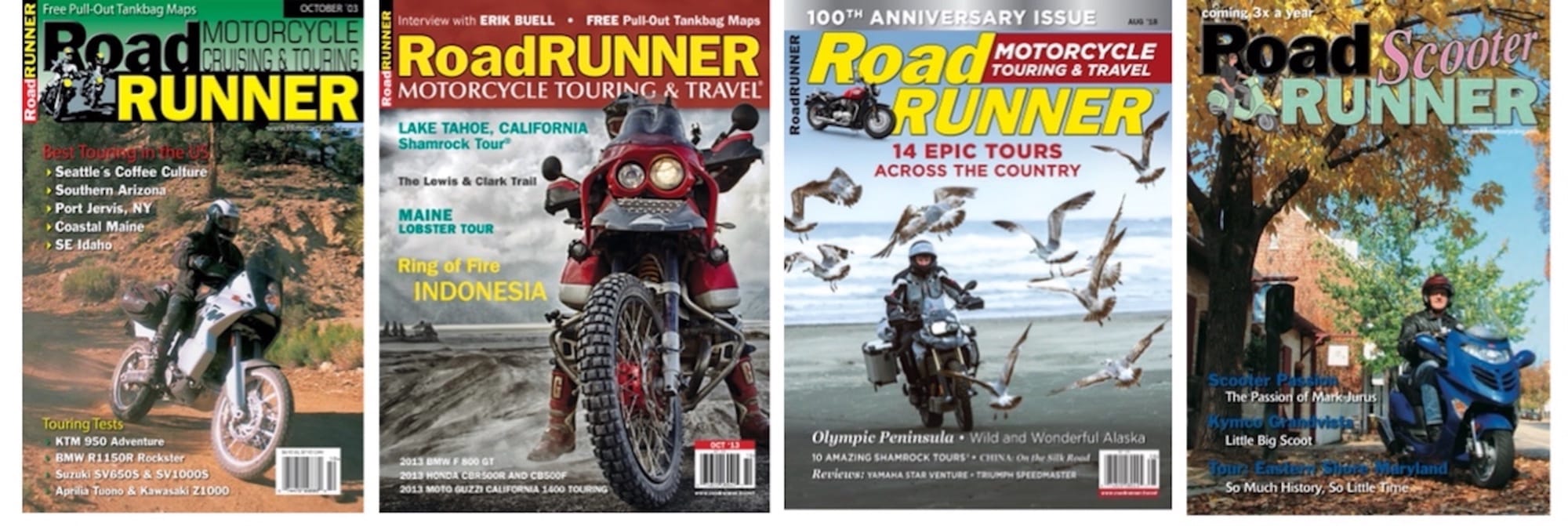
Over the years we’ve used different logo treatments on the cover.
We started out with a “Motorcycle Cruising & Touring” tagline. With the June ‘07 issue, we changed it to “Motorcycle Touring & Travel.”
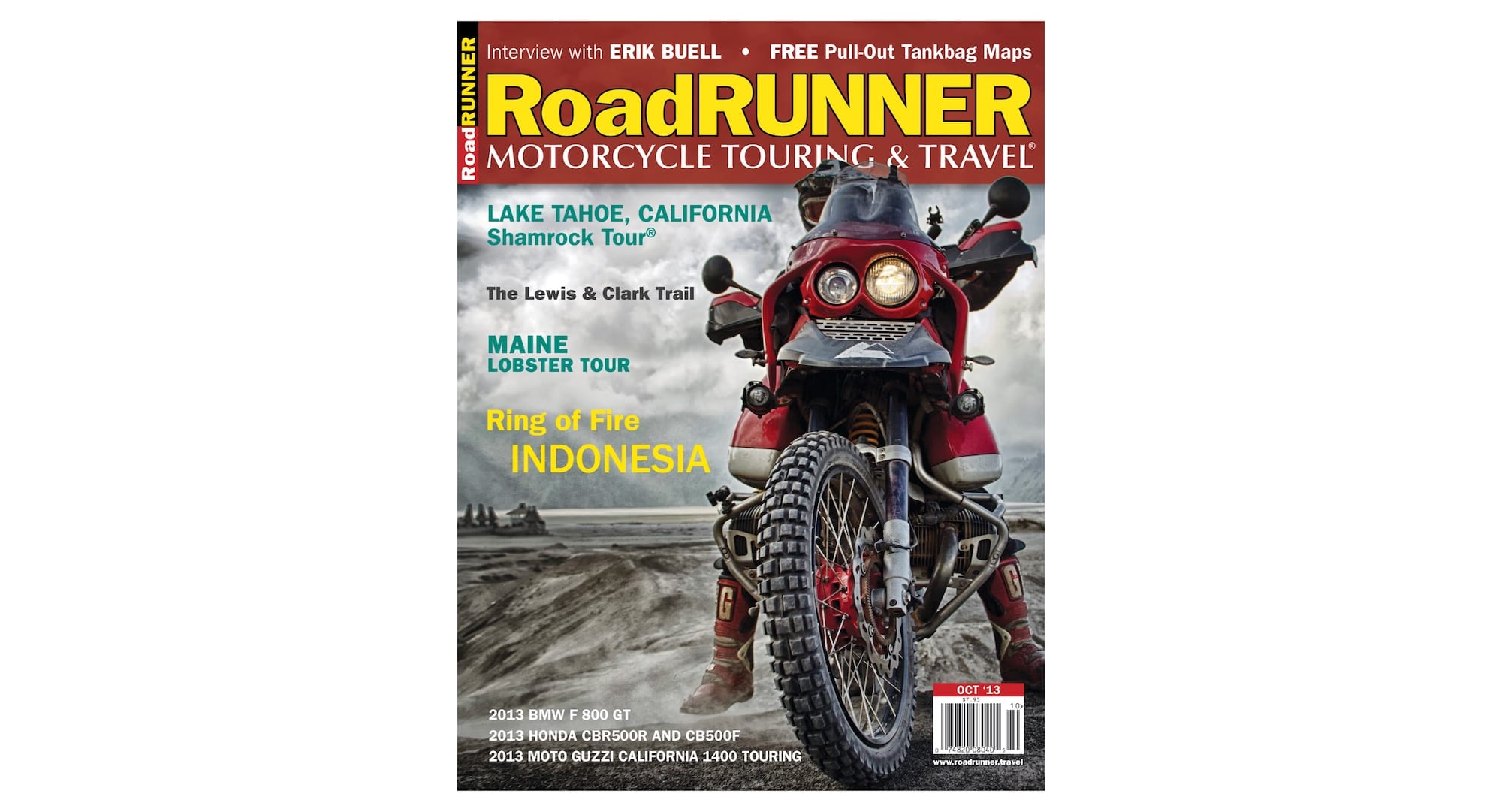
The most radical change happened in 2011, when we wrote RoadRUNNER on one line. It lasted until we went back to the previous iteration with the Apr ‘14 issue.
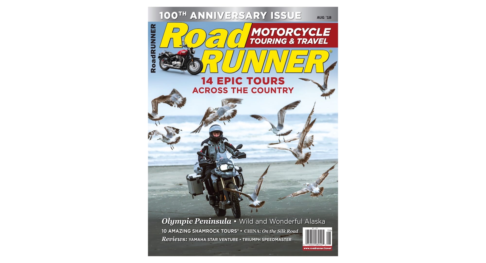
Our 100th issue was a good opportunity for a fresh look. RoadRUNNER got an aggressive forward lean, and we replaced our cartoonish riders with an image of a motorcycle reviewed inside.
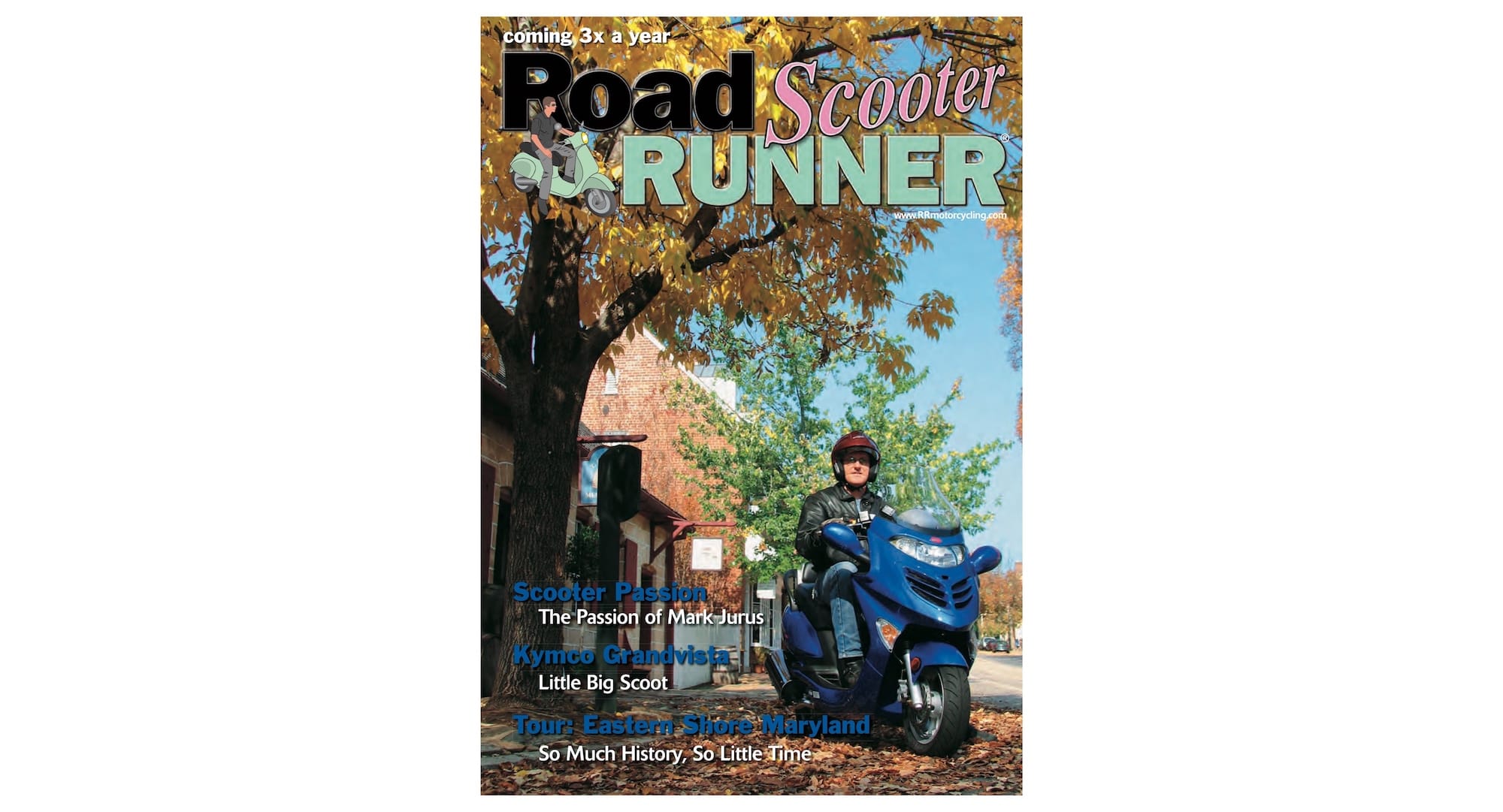
In the early years, we had alternating vintage and scooter special sections at the end of each issue. They had their own special covers inside, like these Jun ’05 scooter and Aug ‘05 vintage sections.
If you spend a lot of time in bookstores looking at the magazine section, you probably have noticed that magazine covers are getting simpler and simpler. Gone are the days of complex images and a ton of words. Nowadays, most magazines feature a very simple image you can make sense of from far away, accompanied by very little text. Of course, this also has something to do with the fact that many of the magazines on the shelf today are special issues and not periodicals. We leaned into the simple cover design this year (as you may have noticed).